
E-Commerce Checkout Optimization: Small UX Changes That Convert
12 October 2026
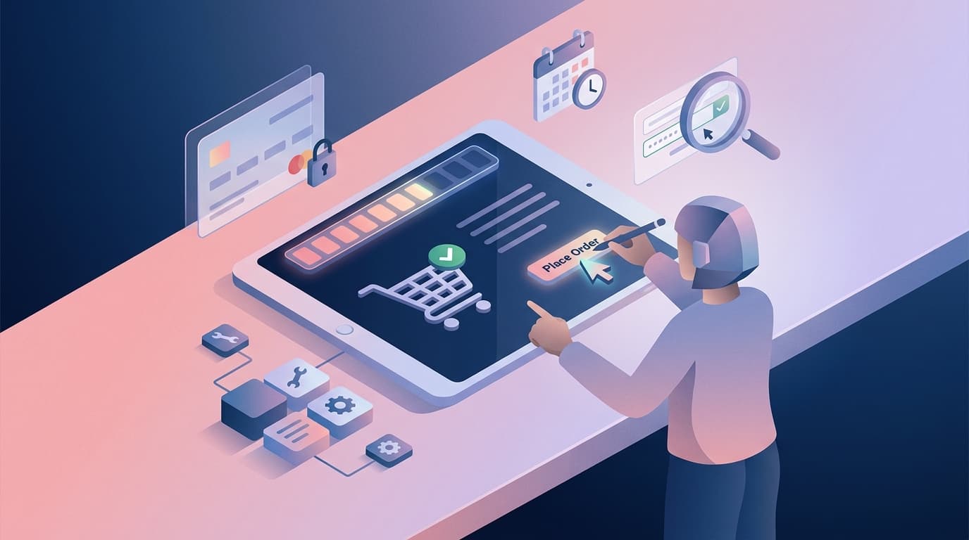
A shopper has found the right product, accepted the price, and added it to the basket. The sale is close, yet the checkout can still lose them through a surprise delivery charge, a form that fails on mobile, or a request to create an account before they can pay. E-commerce checkout optimization is the discipline of removing those last unnecessary obstacles without reducing the information your business needs to fulfil an order well.
Small UX changes can have an outsized effect because checkout is where intent becomes revenue. The goal is not a universal conversion percentage. It is a checkout that is clear, fast, trustworthy, and designed around the way your customers actually buy. This article outlines the changes worth testing first, the technical foundations behind them, and a practical way to measure progress.
Where checkout friction costs revenue
Checkout friction is anything that makes a ready buyer hesitate, work harder, or question whether it is safe to proceed. It is rarely one dramatic flaw. More often, several minor uncertainties compound: a discount field appears before the price is clear, address validation rejects a legitimate format, or an error message disappears when a mobile keyboard covers it.
Watch for these common issues:
- Mandatory account creation before payment.
- Delivery costs, taxes, or return terms revealed too late.
- Long forms that ask for information the business does not use.
- Payment methods that do not match local customer expectations.
- Generic errors that give no clear route to completion.
- Slow pages or redirects between checkout steps.
A good checkout starts with the broader foundations of online-store performance: responsive design, fast pages, secure payments, and reliable support. Optimization then focuses those foundations on the decision point where every extra second and every unclear instruction matters.
High-impact checkout UX changes
Make the total and next step obvious
Show the order total, delivery estimate, taxes, and key return information before the buyer commits to entering every field. A persistent, compact order summary on desktop and an accessible summary on mobile prevent users from wondering what changed. Use a single clear primary action such as “Continue to payment”, not competing buttons with vague labels.
If delivery options change the total, update it immediately and explain why. Transparency builds trust more effectively than a late discount prompt. It also reduces support requests from customers who feel misled after the purchase.
Let customers check out as guests
Guest checkout is often the simplest way to respect a first-time buyer’s intent. You can offer account creation after payment, when the value is clear: order tracking, faster repeat purchase, or easier returns. Do not make a user choose a password before they know whether your store can deliver to their address.
For returning customers, use email recognition carefully. Offer a sign-in link or a saved-address option, but do not block completion if they prefer a fresh guest session. This is user-centred design in practice: the flow adapts to the customer’s goal instead of forcing every customer into the same relationship model.
Reduce fields and help people complete them
Ask only for data you need for payment, delivery, fraud checks, or legal records. Split a full name when a carrier needs it, not because a template includes two fields. Use browser autocomplete, sensible mobile keyboard types, address lookup where it is reliable, and inline validation that explains errors in plain language.
Make error recovery precise. “Enter a valid postcode for Cyprus” is more useful than “Invalid input”. Preserve what the customer has already entered. A robust checkout treats interruptions, typos, and poor connectivity as normal conditions rather than unusual failures.
Match payment and delivery choices to the market
Payment options are a conversion feature and an operational decision. Review what your actual customers use, including cards, trusted wallets, bank-based methods, and appropriate pay-later services. Present fees and security information clearly, then keep the handoff to a payment provider quick and visually consistent.
The same applies to delivery. Give realistic dates, clear collection or courier choices, and an easy way to correct an address. For a Cyprus or EU business, this may include country-specific delivery rules and VAT clarity. The best configuration comes from transaction data and customer research, not a copied list of payment logos.
Design mobile checkout as the primary flow
Mobile users do not tolerate desktop forms squeezed into a narrow screen. Keep labels visible, buttons comfortably tappable, summaries easy to reopen, and keyboard behavior tested on real devices. Avoid forced landscape views, tiny checkbox targets, and content that shifts as payment widgets load.
This is also where technical quality matters. A checkout should gracefully handle a payment timeout, restore a saved basket, avoid duplicate submissions, and give customers a confirmation they can trust. Our guide to web design versus web development is useful context: conversion depends on the experience and the engineering behind it.
How to test changes without guessing
Start with a baseline. Track checkout entry, each step completion, payment failures, successful orders, device type, and support contacts related to payment or delivery. Segment carefully. A problem affecting mobile visitors from one country may disappear in an overall average.
Then make one hypothesis at a time. For example: “Showing delivery cost on the basket page will reduce exits between basket and address.” Test the change against a control where traffic volume allows, or release it to a defined cohort and compare a consistent period. Do not declare a winner from a handful of orders.
A retailer with a multi-step checkout may find that removing an unnecessary company-name field lifts completion for consumer buyers. A B2B supplier may instead benefit most from adding purchase-order support and a clear route to request a quote. Both improvements are valid because they solve a verified user problem.
Build a feedback loop around the data. Review session recordings or usability sessions with consent, read support tickets, and ask recent customers what nearly stopped them. This ongoing optimization is how a site continues to support growth after launch, rather than becoming another neglected operational system.
A practical optimization plan
Use this sequence to turn insight into action:
- This week: Walk your own checkout on a phone and desktop. Record every field, cost reveal, error state, and external redirect.
- This month: Establish funnel measures, interview customers or support staff, and fix the clearest trust and usability issues.
- This quarter: Test prioritized changes, improve payment resilience, and connect checkout insight to your product, fulfillment, and marketing teams.
Choose work by expected impact, effort, risk, and confidence in the evidence. A redesigned button can help, but it should not outrank a payment failure that abandons valid orders. Where the existing platform is limiting the experience, consider whether a custom website or template-based approach gives you the control you need without adding unnecessary complexity.
Conclusion
E-commerce checkout optimization is not about tricking customers through a funnel. It is about making a legitimate purchase feel simple and safe, from a transparent total to a reliable confirmation. Reducing friction, respecting mobile users, and measuring real behavior creates a more efficient operation and a better customer experience at the same time.
Novemind designs and builds e-commerce experiences that connect user needs with scalable technology. If your checkout is losing customers or creating avoidable support work, start the conversation.
Related reading:


